Constructing tables is an art – maximizing readability and information can be challenging. The image is of the Turning Torso in Malmö and is CC by Alan Lam.
Fast-track publishing using knitr is a short series on how I use knitr to speedup publishing in my research. While illustrations (previous post) are optional, tables are not, and this fourth article is therefore devoted to tables. Tables through knitr is probably one of the most powerful fast-track publishing tools, in this article I will show (1) how to quickly generate a descriptive table, (2) how to convert your regression model into a table, and (3) worth knowing about table design and anatomy.
The series consists out of five posts:
- First post – an intro motivating knitr in writing your manuscript and a comparison of knitr to Word options.
- Second post – setting up a .RProfile and using a
custom.cssfile. - Third post – getting your plots the way you want.
- Fourth post – generating tables (current post).
- Fifth post – summary and example.
Data set preparation
To make this post more concrete I will use the melanoma data set in the boot package. Below I factor the variables:
library(boot)

# Set time to years instead of days
melanoma$time_years <-
  melanoma$time / 365.25

# Factor the basic variables that
# we're interested in
melanoma$status <-
  factor(melanoma$status,
         levels=c(2,1,3),
         labels=c("Alive", # Reference
                  "Melanoma death",
                  "Non-melanoma death"))
melanoma$sex <-
  factor(melanoma$sex,
         labels=c("Male",
                  "Female"))

melanoma$ulcer <-
  factor(melanoma$ulcer,
         labels=c("Present",
                  "Absent"))
Descriptive tables
Generating descriptive tables containing simple means, medians, ranges, frequencies, etc. should be fast and efficient. Decide on what you want in your columns and then structure your data into sections; I try to use the following structure:
- Basic stats: e.g. sex, age.
- Article specific stats: e.g. hip function, degree of osteoarthritis, type of surgery.
- Outcomes: e.g. number of re-operations, mobility, pain.
After deciding on the variables I often use the getDescriptionStatsBy function from my Gmisc-package to get the statistics into columns. I've found that you almost always have more than one column, thereby comparing different groups. In an RCT you want to compare the treatment groups, in a case-control study you want to compare the cases to the controls, and in an observational survival study you usually want to compare those that survived with those that died (as in this example). If you are uncertain what groups to compare in your Table 1, then just compare those with complete data to those with missing data.
The getDescriptionStatsBy function has several settings that you may want to use:
- P-values: While some despise the use of p-values in tables, I believe they can be useful in some cases and my function can therefore fetch
fisher.testorwilcox.testp-values depending on the variable type by simply specifyingstatistics=TRUE. - Total-column: Adding a total-column may sometimes be useful, e.g. if you have by alive/dead it is of interest to quickly get a total-column, while if you present your data by RCT-group then a total-column makes little sense.
- Percentages for categorical variables: depending on the setting you may want your percentages to sum up horizontally or vertically, e.g. in an alive/dead setting it makes sense to sum up the columns horizontally using
hrzl_prop=TRUEwhile an RCT is better to sum up vertically where you want to show how many cemented, uncemented, mixed hip replacements were in each treatment arm.
As the getDescriptionStatsBy has plenty of options, I usually use a wrapper function like this:
# A function that takes the variable name,
# applies it to the melanoma dataset
# and then runs the results by the status variable
getT1Stat <- function(varname, digits=0){
  getDescriptionStatsBy(melanoma[, varname],
                        melanoma$status,
                        add_total_col=TRUE,
                        show_all_values=TRUE,
                        hrzl_prop=TRUE,
                        statistics=FALSE,
                        html=TRUE,
                        digits=digits)
}

# Save everything in a list
# This simplifies the row grouping
table_data <- list()

# Get the basic stats
table_data[["Sex"]] <- getT1Stat("sex")
table_data[["Age"]] <- getT1Stat("age")
table_data[["Ulceration"]] <- getT1Stat("ulcer")
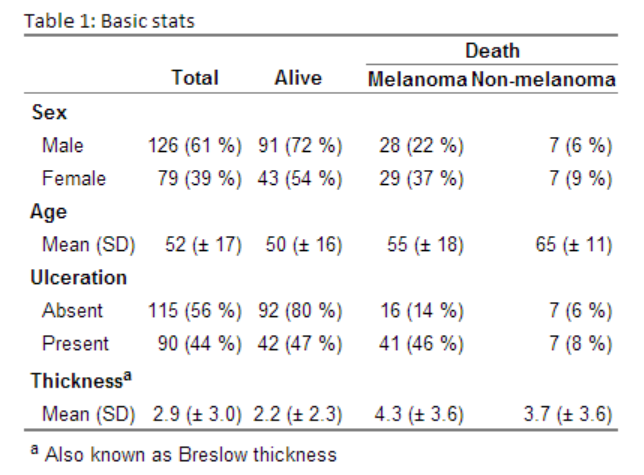
table_data[["Thicknessa"]] <- getT1Stat("thickness", 1)
There is of course a myriad of alternatives for generating descriptive data. My function is trying to resemble the format for Table 1 in major medical journals, such as NEJM and Lancet. You can easily tailor it to your needs, for instance if you want to use median instead of mean for continuous variables, you provide it a different continuous function:
# A function that takes the variable name,
# applies it to the melanoma dataset
# and then runs the results by the status variable
getT1Stat <- function(varname, digits=0){
  getDescriptionStatsBy(melanoma[, varname],
                        melanoma$status,
                        add_total_col=TRUE,
                        show_all_values=TRUE,
                        hrzl_prop=TRUE,
                        statistics=FALSE,
                        html=TRUE,
                        digits=digits,
                        continuous_fn=describeMedian)
}
Apart from my function I've recently discovered the power of the plyr-package that can help you generate most table/plot data. I strongly recommend having a closer look at the ddply function - it will save you valuable time.
After running the previous code I loop through the list to extract the variable matrix and the rgroup/n.rgroup variables that I then input to my htmlTable function:
# Now merge everything into a matrix
# and create the rgroup & n.rgroup variabels
rgroup <- c()
n.rgroup <- c()
output_data <- NULL
for (varlabel in names(table_data)){
  output_data <- rbind(output_data,
                       table_data[[varlabel]])
  rgroup <- c(rgroup,
              varlabel)
  n.rgroup <- c(n.rgroup,
                nrow(table_data[[varlabel]]))
}


# Add a column spanner for the death columns
cgroup <- c("", "Death")
n.cgroup <- c(2, 2)
colnames(output_data) <- gsub("[ ]*death", "", colnames(output_data))

htmlTable(output_data, align="rrrr",
          rgroup=rgroup, n.rgroup=n.rgroup,
          rgroupCSSseparator="",
          cgroup = cgroup,
          n.cgroup = n.cgroup,
          rowlabel="",
          caption="Basic stats",
          tfoot="a Also known as Breslow thickness",
          ctable=TRUE)
Generating this beauty (the table is an image as the CSS for the site messes up the layout):
Regression tables
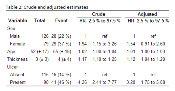
I recently did a post on my printCrudeAndAdjustedModel-function where I showed how to output your model into a table. My function allows you to get both unadjusted and adjusted estimates into a table, adds the references, and allows can automatically attach the descriptive statistics:
# Setup needed for the rms coxph wrapper
ddist <- datadist(melanoma)
options(datadist = "ddist")
fit <- cph(Surv(time, status=="Melanoma death") ~
               sex + age + thickness + ulcer, data=melanoma)

printCrudeAndAdjustedModel(fit, desc_digits=0,
                           caption="Crude and adjusted estimates",
                           desc_column=TRUE,
                           add_references=TRUE,
                           ctable=TRUE)
Gives this:
Now there are alternatives to my function. The texreg is an interesting package that is worth exploring and hopefully stargazer will eventually have an html/markdown option. A minor note concerning these later packages where outputs contain R2 and more; I have never seen models presented in medical literature in that way and if you need to adjust the output you loose the fast-track idea.
Table design and anatomy
Tables are generally good for comparing a few values, while plots are better when you want to show a trend consisting of multiple values. Although you should avoid using tables to show trends, you can still have large tables with lots of data. When presenting a lot of data, you need to think about the table navigation:
- Order: always report variables in the same order, e.g. sex, age, ulceration... should be at a similar location in each table
- Precision: avoid unnecessary decimals
- Markup: use headers and spanners
The first one we have already touched upon. For the second one, I often rely on the sprintf function. While round may seem like a natural option you will often want to show all decimals that you find of interest. For instance:
round(3.901, digits=2) # 3.9
round(3.901, digits=3) # 3.901

# The format function works better although
# you need to remember the nsmall option:
# "the minimum number of digits to the right of the decimal point"
format(3.901, digits=2) # 3.9
format(3.901, digits=2, nsmall=2) # 3.90
format(3.901, digits=3, nsmall=2) # 3.90
format(3.901, digits=4, nsmall=2) # 3.901

sprintf("%.2f", 3.901) # 3.90
sprintf("%.1f HR (95 %% CI %.1f to %.1f)",
        exp(coef(fit)),
        exp(confint(fit)[,1]),
        exp(confint(fit)[,2]))
# "0.9 HR (95 % CI 0.6 to 1.4)"
# "1.0 HR (95 % CI 1.0 to 1.0)"
# "1.0 HR (95 % CI 0.7 to 1.4)"
Also a p-value converter is nice to have; here is a simple function that I use:
pvalue_formatter <- function(pvalues, sig.limit = 0.001){
  sapply(pvalues, function(x, sig.limit){
    if (x < sig.limit)
      return(sprintf("< %s", format(sig.limit)))
    # < stands for < and is needed
    # for the markdown/html to work
    # and the format is needed to avoid trailing zeros

    # High p-values you usually want two decimals
    # otherwise report only one
    if (x > 0.01)
      return(format(x, digits=2))

    return(format(x, digits=1))
    }, sig.limit=sig.limit)
}

pv <- c(.133213, .0611233, .004233, .00000123123)
pvalue_formatter(pv)
# "0.13"
# "0.061"
# "0.004"
# "< 0.001"
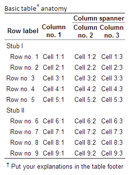
There are standard tools that you can us to help your readers to navigate the tables. I use stubs and column spanners as much as I can. A stub is a row header at the same column level as the actual rows, the rows differ by a small indentation of two white-spaces. This is an efficient way of grouping variables without making the table wider, while at the same time adding some white space around the numbers that help navigating. Similarly to stubs you can have column spanners that group columns. In my htmlTable these are called rgroup and cgroup arguments. They need to have the n.rgroup/n.cgroup in order to let the function know how many rows/columns each group should contain, see below example:
col <- sprintf("Cell %d:%%d", 1:9)
vars <- sapply(1:3, function(i) sprintf(col, i))

rownames(vars) <- sprintf("Row no. %d", 1:nrow(vars))
colnames(vars) <- sprintf("Column
no. %d", 1:3)
cgroup <- c("", "Column spanner")
n.cgroup <- c(1, 2)
rgroup <- c("Stub I", "", "Stub II")
n.rgroup <- c(2, 3, nrow(vars) - 2 - 3)
htmlTable(vars,
          rowlabel="Row label",
          cgroup=cgroup, n.cgroup=n.cgroup,
          rgroup=rgroup, n.rgroup = n.rgroup,
          rgroupCSSstyle="", rgroupCSSseparator="",
          caption="Basic table† anatomy",
          tfoot="† Put your explanations in the table footer",
          ctable=TRUE)
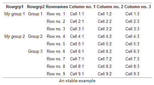
An alternative to using stubs is using row headers. The difference is that headers are located in a separate column, thus making the table wider. A benefit is that you can have infinite levels row group headers. Below is an example with two header levels using the xtable function:
library(xtable)
alt_vars <- cbind(
  Rowgrp1 = c("Mjr group 1", "", "",
              "Mjr group 2", "", "", "", "", ""),
  Rowgrp2 = c("Group 1", "", "",
              "Group 2", "",
              "Group 3", "", "", ""),
  Rownames= rownames(vars),
  vars)
colnames(alt_vars) <- gsub("
", "\n", colnames(alt_vars))
# rownames(vars) <- NULL
options(xtable.html.table.attributes =
          list(style=sprintf("style='%s'",
                             paste("border:0",
                                   "border-top: 1px solid grey",
                                   "border-bottom: 1px solid grey",
                                   sep="; "))))
print(xtable(alt_vars, caption="An xtable example"), type="html", include.rownames = FALSE)
I hope you found this useful. In the next post I'll have a summary with an example for those of you new to knitr.
Previous post in this series
- First post - an intro motivating knitr in writing your manuscript and a comparison of knitr to Word options.
- Second post - setting up a .RProfile and using a
custom.cssfile. - Third post - getting your plots the way you want.


I find this series of posts so incredibly useful. Thanks!
First of all, I have to thank you for all the hard work.
I am trying to use the getDescriptionStatsBy function with continuous variables and when I set statistics=T, turns out that the p-value is always <0.0001.
Any idea what I could be doing wrong?
What package version are you using? Have you tried the latest version?
Hi Max. As a fellow clinician I found your Table 1 generator extremely helpful – it produces a very professional, publication quality result. I liked it so much I have knocked together a Shiny based UI for selecting fields from a dataframe and various table and column options. Its a work in progress and probably still pretty buggy but feel free to try it out: https://github.com/dkilfoyle/Table1
I haven’t converted it to package format yet (I’ve never done this before). So I think you will need to download the whole lot and run shiny::runApp() from the base directory. You will need to install the shiny, shinyAce and whisker packages (and Gmisc of course!).
Wow, that’s awesome – thank you for sharing!
Hey Max,
Thanks so much for writing this up! My colleagues and I find your Table 1 better than pretty much everything else out there that we could find. One question we had was how we could output the table to LaTeX without horizontal lines being placed after each stub? Thanks!
Thank you. Unfortunately I have no experience beyond LaTeX basics and I guess you need to redefine the stub element in order to get it to work properly.
Pingback: Tabela 1 a pakiet Gmisc | SmarterPoland.pl