My favorite tool for creating flow diagram is Dia – it’s easy and open source. It’s homepage is not that impressive but the Facebook group seems to be pretty active. There you can also find that downloads increased by 23 % in 2011 to 1.4 million downloads.
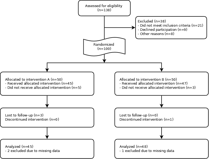
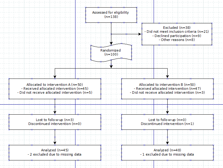
In this tutorial I want to show you how easy you can create a great looking flow diagram like the one CONSORT recommends for publication of RCT:s.
Our end result will look like this:
1. The software
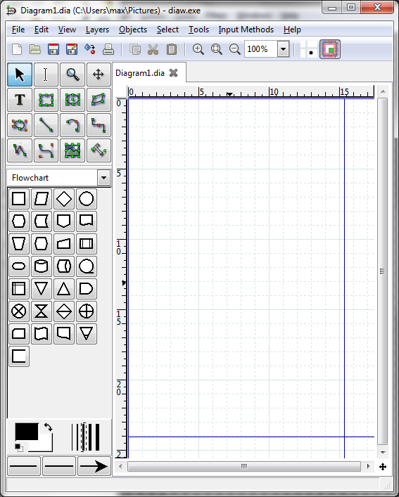
Download and install the software. Start it up and you get a screen like this:
Yes it doesn’t look that great but once you export it you get rid of all the grids and things.
Tips:
To scroll horizontally: scroll-wheel + shift
To zoom: scroll-wheel + ctrl
2. Prepare text
Write all the cell information in notepad/word. There is no spell checking in Dia and the select/delete text functions are not that developed and it’s therefore useful to have the data written down elsewhere
3. Shapes
Choose a group of shapes that you want to use.
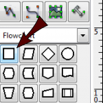
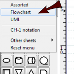 Use the box shape to start with:
4. Snap to grid setting
Make sure you have snap to grid set. This makes it easier for you to make the boxes even sized/placed since they will arrange themselves along the grid.
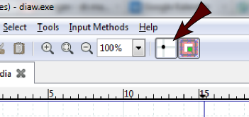 5. First boxes
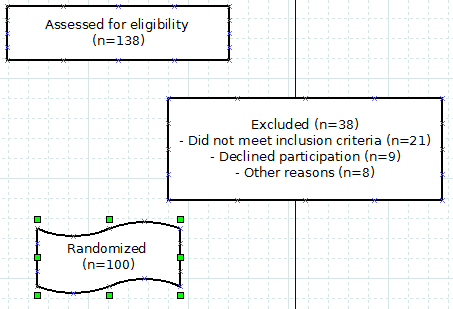
Draw your first few boxes and fill them with text.
I’ve used a slightly different box for the randomized to make it stand out but I’m not sure that I would actually use that in an article. I would recommend skipping that since you might have a harder time getting your arrows straight.
6. Arrows
Connect the boxes with arrows. Use the line tool.
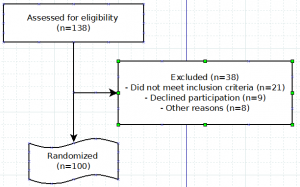
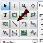 Draw first a line between assessed & randomized boxes:
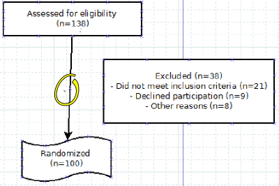 By clicking on the x along the line you can draw a new line to the excluded box:
 7. Align the boxes
I guess you’ve so far only been annoyed by the snap-to-grid function but now you get to use its full benefits. As you can see the arrows are often not at 90 degree angles and in most cases that looks best.
Try to resize the boxes so that they fit the underlying grid. The arrows are related to the centers of the boxes and therefore you have to get the boxes the right size if it’s going to work.
If you feel it’s hard then start by zooming in and usually all the handles (the red arrow) are easier to grab and pull the size onto the blue line (the one the blue arrow indicates):
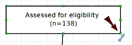 You should end up with something like this:
 8. Randomization split
Add two boxes below the randomized box. They should be the same size and equally far spaced. The easiest way is to do the first, size it to snap onto the grid and then to copy the second:
 Now add the lines. First draw a straight line down from the randomization. From that arrow draw to zigzag lines. You usually need to adjust the zigzaglines by dragging the orange middle marker:
 In the end you should have something like this:
 9. The follow-up and analyzed boxes
This is simply repeating the above steps. The best is to copy the allocated boxes to get the right width and then. You should get something like this in the end:
10. Prettify
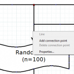
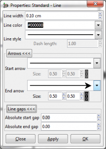
To get the image more like the CONSORT we remove the arrow to the randomized box to get just a straight line, right click on the line and choose properties:
And then properties change the arrow to a strait line:
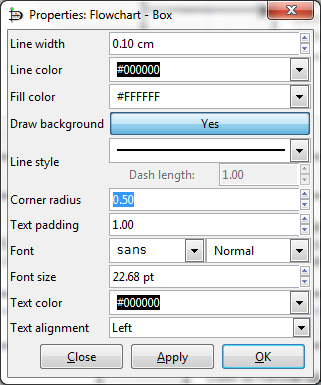
 I like the ones with soft corners – they’re soft on the eyes while not annoyingly 3D-fancy. All you need to do is select all the boxes that you want to smooth the edge, right-click on one of them, select properties and set radius to .5 or something similar. In the properties you can also change the text alignment.
You can find the final .dia file here.
Wow… this took a little longer than expected to do but hopefully it will come in handy 🙂

