A forest plot using different markers for the two groups
In order to celebrate my Gmisc-package being on CRAN I decided to pimp up the forestplot2 function. I had a post on this subject and one of the suggestions I got from the comments was the ability to change the default box marker to something else. This idea had been in my mind for a while and I therefore put it into practice.
Forest plots (sometimes concatenated into forestplot) date back at least to the wild ’70s. They are an excellent tool to display lots of estimates and confidence intervals. Traditionally they’ve been used in meta-analyses although I think the use is spreading and I’ve used them a lot in my own research.
For convenience I’ll use the same setup in the demo as in the previous post:
library(Gmisc)
Sweden
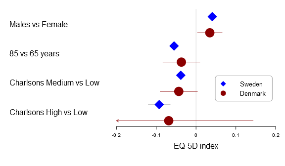
Here is the basic multi-line forest plot:
forestplot2(mean=cbind(Sweden[,"coef"], Denmark[,"coef"]),
            lower=cbind(Sweden[,"lower"], Denmark[,"lower"]),
            upper=cbind(Sweden[,"upper"], Denmark[,"upper"]),
            labeltext=rownames(Sweden),
            legend=c("Sweden", "Denmark"),
            # Added the clip argument as some of
            # the Danish CI are way out therer
            clip=c(-.2, .2),
            # Getting the ticks auto-generate is
            # a nightmare - it is usually better to
            # specify them on your own
            xticks=c(-.2, -.1, .0, .1, .2),
            boxsize=0.3,
            col=fpColors(box=c("blue", "darkred")),
            xlab="EQ-5D index",
            new_page=TRUE)
The package comes with the following functions for drawing each confidence interval:
- fpDrawNormalCI – the regular box confidence interval
- fpDrawCircleCI – draws a circle instead of a box
- fpDrawDiamondCI – draws a diamond instead of a box
- fpDrawPointCI – draws a point instead of a box
- fpDrawSummaryCI – draws a summary diamond
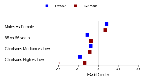
Below you can find the all four alternatives:
forestplot2(mean=cbind(Sweden[,"coef"], Denmark[,"coef"]),
            lower=cbind(Sweden[,"lower"], Denmark[,"lower"]),
            upper=cbind(Sweden[,"upper"], Denmark[,"upper"]),
            labeltext=rownames(Sweden),
            legend=c("Sweden", "Denmark"),
            clip=c(-.2, .2),
            xticks=c(-.2, -.1, .0, .1, .2),
            boxsize=0.3,
            col=fpColors(box=c("blue", "darkred")),
            # Set the different functions
            fn.ci_norm=
              list(fpDrawNormalCI,
                   fpDrawCircleCI,
                   fpDrawDiamondCI,
                   fpDrawPointCI),
            pch=13,
            xlab="EQ-5D index",
            new_page=TRUE)
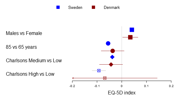
The fn.ci_norm accepts either a single function, a list of functions, a function name, or a vector/matrix of names. If the list is one-leveled or you have a vector in a multi-line situation it will try to identify if the length matches row or column. The function tries to rewrite to match your the dimension of your multi-line plot, hence you can write:
# Changes all to diamonds
fn.ci_norm="fpDrawDiamondCI"

# The Danish estimates will appear as a circle while
# Swedes will be as a diamond
fn.ci_norm=list(fpDrawDiamondCI, fpDrawCircleCI)

# Changes first and third row to diamond + circle
fn.ci_norm=list(list(fpDrawDiamondCI, fpDrawCircleCI),
                list(fpDrawNormalCI, fpDrawNormalCI),
                list(fpDrawDiamondCI, fpDrawCircleCI),
                list(fpDrawNormalCI, fpDrawNormalCI))

# The same as above but as a matrix diamond + circle
fn.ci_norm=rbind(c("fpDrawDiamondCI", "fpDrawCircleCI"),
                 c("fpDrawNormalCI", "fpDrawNormalCI"),
                 c("fpDrawDiamondCI", "fpDrawCircleCI"),
                 c("fpDrawNormalCI", "fpDrawNormalCI"))
If you use the same number of lines as the lines the legend will automatically use your custom markers although you can always just use the legendMarkerFn argument:
forestplot2(mean=cbind(Sweden[,"coef"], Denmark[,"coef"]),
            lower=cbind(Sweden[,"lower"], Denmark[,"lower"]),
            upper=cbind(Sweden[,"upper"], Denmark[,"upper"]),
            labeltext=rownames(Sweden),
            legend=c("Sweden", "Denmark"),
            legend.pos=list(x=0.8,y=.4),
            legend.gp = gpar(col="#AAAAAA"),
            legend.r=unit(.1, "snpc"),
            clip=c(-.2, .2),
            xticks=c(-.2, -.1, .0, .1, .2),
            boxsize=0.3,
            col=fpColors(box=c("blue", "darkred")),
            # Set the different functions
            fn.ci_norm=c("fpDrawDiamondCI", "fpDrawCircleCI"),
            xlab="EQ-5D index",
            new_page=TRUE)
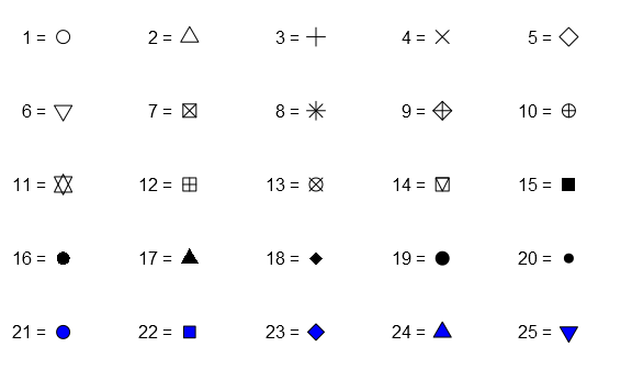
Now for the pch-argument in the fpDrawPointCI you can use any of the predefined integers:
grid.newpage()
for(i in 1:5){
  grid.text(sprintf("%d = ", ((i-1)*5+1:5)),
            just="right",
            x=unit(seq(.1, .9, length.out=5), "npc")-unit(3, "mm"),
            y=unit(rep(seq(.9, .1, length.out=5)[i], times=5), "npc"))

  grid.points(x=unit(seq(.1, .9, length.out=5), "npc"),
              y=unit(rep(seq(.9, .1, length.out=5)[i], times=5), "npc"),
              pch=((i-1)*5+1:5),
              gp=gpar(col="black", fill="blue"))

}
If you are still not satisfied you have always the option of writing your own function. I suggest you start with copying the fpDrawNormalCI and see what you want to change:
fpDrawNormalCI 1
    cliplower 1

  # Lastly draw the box if it is still there
  if (!skipbox){
    # Convert size into 'snpc'
    if(!is.unit(size)){
      size
The estimate and the confidence interval points are provided as raw numbers and are assumed to be “native”, that is their value is the actual coefficient and is mapped correctly as is.
Note that all the regression functions in the Gmisc-package have moved to the Greg-package, soon to be available on CRAN… but until I have added some more unit tests you need to use the GitHub version.
Could you make x-axis coordinate for one line?
I’m not sure what you mean x-axis coordinate.
Many thanks for your reply. Mean that zero=0, I want zero=1.
Just set the zero option to 1. Below is an example where the zero effect is 0.15 with a tick mark at that point (the example is using the tutorial data):
forestplot2(zero=0.15, mean=cbind(Sweden[,"coef"], Denmark[,"coef"]), lower=cbind(Sweden[,"lower"], Denmark[,"lower"]), upper=cbind(Sweden[,"upper"], Denmark[,"upper"]), labeltext=rownames(Sweden), legend=c("Sweden", "Denmark"), clip=c(-.2, .2), xticks=c(-.2, -.1, .0, .15, .2), boxsize=0.3, col=fpColors(box=c("blue", "darkred")), xlab="EQ-5D index", new_page=TRUE)Dear Dr.Max Gordon,
I would like to thank you very much for your forest plot. I have found it very useful.
And, I have learn from the forest plot you posted.
Dear Max,
I found the forestplot2 very useful.
How can I combine multiple forestplot2 into a single plot?
Since Gmisc is not a base graphics I cannot use layout, par(mfrow), or even grid.arrange..
Many thanks.
All the graphs rely heavily on the grid package, you need to use the viewport system. It may seem complicated but the structure is actually rather simple and to get the plots aligned side by side you simply specify:
# Print two plots side by side using the grid # package's layout option for viewports grid.newpage() pushViewport(viewport(layout = grid.layout(1, 2))) pushViewport(viewport(layout.pos.col = 1)) forestplot2(row_names, test_data$coef, test_data$low, test_data$high, zero = 1, cex = 2, lineheight = "auto", xlab = "Lab axis txt") popViewport() pushViewport(viewport(layout.pos.col = 2)) forestplot2(row_names, test_data$coef, test_data$low, test_data$high, zero = 1, cex = 2, lineheight = "auto", xlab = "Lab axis txt") popViewport() popViewport()Hi Max,
Many thanks for the prompt response and sorry for the delay.
When using the your code above I got an error after ‘popViewport()’ saying:
Error in grid.Call.graphics(L_unsetviewport, as.integer(n)) :
cannot pop the top-level viewport (‘grid’ and ‘graphics’ output mixed?)
Any clue on what’s wrong?
(to quickly try things I’m using your forestplot2 code: http://gforge.se/2014/02/pimping-your-forest-plot/#more-1160)
You have most likely omitted a pushViewport(). If you just run:
It will give the error message:
Error in grid.Call.graphics(L_unsetviewport, as.integer(n)) :cannot pop the top-level viewport ('grid' and 'graphics' output mixed?)
Hi Max,
Please ignore the query above. In the forestplot2 code, I set the option new_page=FALSE, and the viewport() worked fine, thanks.
On another note, I noticed CRAN removed the package ‘grid’ so I couldn’t find too much detail about it. For example, do you know how to specify a common legend for a grid of plots?
The grid-package is now part of the source code, you can find it here. Paul Murrell has a page on the grid-package although it is slightly outdated. There are some excellent vignettes for the grid package, just write
vignette(package="grid")Hi Max, thanks for the helpful post. Do you know if there’s any way to create a range for the zero effect, which would be visualized as a wider bar than just a line? For example, if zero effect was anywhere from 50-55 degrees.
Excellent idea, this is now possible for the 1.0 version. Note that this is in development, you need to follow these instructions.
Hello Dr Gordon! thank ou very much for this post, it has been extremely useful. I’m now trying to plot the summary effect size in the very last row of the forestplot I’ve got. I tried to use the function fpDrawSummaryCI(lower_limit, estimate, upper_limit, size, col, y.offset = 0.5,
…).
I’ve gotten the errors
“Error in prFpGetConfintFnList(fn = confintNormalFn, no_rows = NROW(mean), :
You do not have the same number of confidence interval functions as you have number of rows: 7!=62 You should provide the same number.”
and
“Error in unit(x, default.units) : ‘x’ and ‘units’ must have length > 0”
So, maybe in the first error it means I have to add the values of the summary effect on the matrix long before or can I put them just directly into the function (that’s actuall what I’m doing).
For the second error, I made a conversion to npc as suggested, but apparently the values are fine.
could you please tell me how can I put this summary effect size? maybe I’m too lost and has nothing to do with the function fpDrawSummaryCI. Therefore, any help would be highly appreciated! thank you
The fpDrawSummaryCI is only used for drawing the confidence intervals. I think that what you want is a to set the parameter
is.summary. If you have 7 rows and the last one is a summary row then you set the variable tois.summary = c(rep(FALSE, time=6), TRUE).Best
Max
Hi Max, I really like the look of these plots and I’ve been trying to work out if the forestplot package can do what I want. I’d like to use it as a traditional forest plot for a meta-analysis, but with several estimates per study, with columns for both the study names and the various variables that I’m comparing. I’d like to colour code the different types of variables. Am I right in understanding that the forestplot package can set different colours when there’s more than one estimate per row, but can not set different across rows?
Hi Max,
This is awesome. Very clear!
I am wondering if there is a way to add a border to the graph (either directly to the forestplot or outside everything)?
Many thanks!!!
If you want to have a border around the entire forestplot I think it is easiest to add a viewport and a rect within it using the built-in grid package.
Dear Max,
Thanks for a nice package. I have used it several times 🙂
I am now trying to add a table to a plot similar to what you have in your example here. The problem is that it seems that I can only add a table of estimates associated with each row, but in reality each row is composed by two levels (in your example Denmark and Sweden). Do you think it is possible with the current implementation to have such a table?
Thanks for your help.
All the best,
Federica
I’m not a big fan of having estimates in the plot, I usually prefer to have them in a table so people can copy-paste them if they wish. Multiple estimates per row are by definition a method for comparing trends and getting an overview, values lack this feature and thus it doesn’t really make sense to include them. If you really want them I would go with value_a/value_b in a single cell.
I used fpDrawPointCI in fn.ci_norm and then set pch=24 to get a triangle.
But the legend still shows the legend for Point (a circle).
Is there a solution for this?
Thanks for this very useful package
Please post an issue on the Github page for the package and I’ll try to have a look