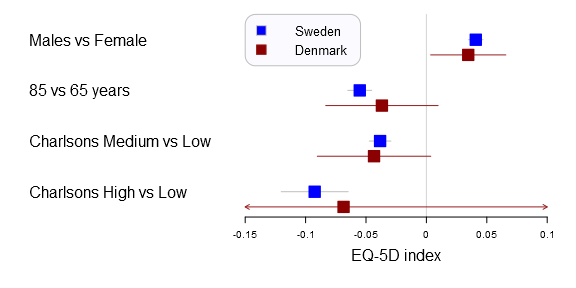
A forestplot that compares Swedish and Danish EQ-5D outcome predictors generated with the forestplot2()-function in the Gmisc-package
Displaying large regression models without overwhelming the reader can be challenging. I believe that forestplots are amazingly well suited for this. The plot gives a quick understanding of the estimates position in comparison to other estimates, while also showcasing the uncertainty. This project started with some minor tweaks to prof. Thomas Lumleys forestplot and ended up in a complete remake of the function. In this post I’ll show you how to tame the plot using data from my latest article.
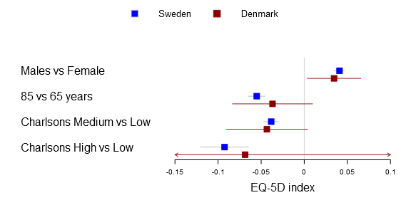
I’ve used the plots in my two latest publications and they have had a warm reception. In the latest study we compared Swedish with Danish patient’s health related quality of life after a total hip arthroplasty. We were interested in comparing if there was a difference between common explanatory variables in Denmark and Sweden, i.e. the generalizability. The Swedish data set was vast while the Danish was a tiny sample resulting in very different confidence intervals. You can find the main graph below.

Comparison of factors influencing EQ-5D index between Swedish and Danish patients. Forest plot with 95% confidence intervals for the estimates of EQ-5D index one year after THR for gender (reference=female), age 85 years (reference=65 years), and medium or high Charlson (reference=low Charlson) for Swedish (blue) and Danish (red) patients (This graph was generated with an older forestplot2-version than the one reported below)
Gordon et al. BMC Musculoskeletal Disorders 2013 14:316 doi:10.1186/1471-2474-14-316
Tutorial data
Below you can find a data dump for the estimates that I used to generate the plot.
Sweden <-
  structure(
            c(0.0408855062954068, -0.0551574080806885,
              -0.0383305964199184, -0.0924757229652802,
              0.0348395599810297, -0.0650808763059716,
              -0.0472794647337126, -0.120200006386798,
              0.046931452609784, -0.0452339398554054,
              -0.0293817281061242, -0.0647514395437626),
            .Dim = c(4L, 3L),
            .Dimnames = list(c("Males vs Female", "85 vs 65 years",
                              "Charlsons Medium vs Low", "Charlsons High vs Low"),
                             c("coef", "lower", "upper")))

Denmark <-
  structure(
            c(0.0346284183072541, -0.0368279085760325,
              -0.0433553672510346, -0.0685734649940999,
              0.00349437418972517, -0.0833673052667752,
              -0.0903366633240568, -0.280756832078775,
              0.065762462424783, 0.00971148811471034,
              0.00362592882198759, 0.143609902090575),
            .Dim = c(4L, 3L),
            .Dimnames = list(c("Males vs Female", "85 vs 65 years",
                               "Charlsons Medium vs Low", "Charlsons High vs Low"),
                             c("coef", "lower", "upper")))
The forestplot tutorial
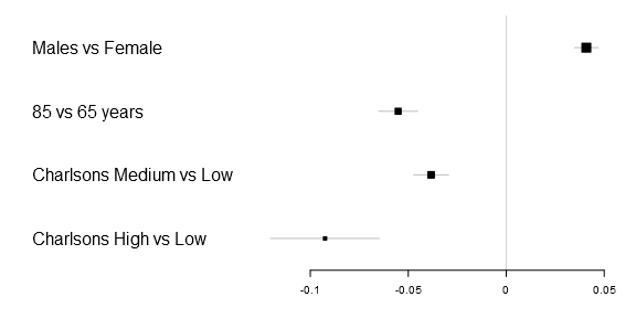
Lets start with the basic code to generate a simple forestplot. The xticks parameter is not necessary but in this particular example the 0.05 tick is otherwise not included and I therefore added it. Note: you need to download my package, you can find the Gmisc-package here, for this tutorial to work.
library(Gmisc)
forestplot2(mean=Sweden[,"coef"],
            lower=Sweden[,"lower"],
            upper=Sweden[,"upper"],
            labeltext=rownames(Sweden),
            xticks=c(-.1, -.05, 0, .05))
Greek letters
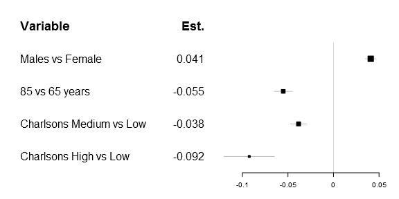
One of the first things that got me tweaking the original forestplot function was that I wanted to have a simple expression in the header. Getting a matrix into the original function was rather simple, as you can see below:
# Prepare a new matrix where the top row is empty
Sweden_w_header <- rbind(rep(NA,times=ncol(Sweden)),
                         Sweden)
# Add a row name
rownames(Sweden_w_header)[1] <- "Variable"

# Create the matrix
lab_mtrx <- cbind(rownames(Sweden_w_header),
                  append("Est.",
                         round(Sweden_w_header[,"coef"],3)[2:5]))

# Do the actual plot
forestplot2(mean=Sweden_w_header[,"coef"],
            lower=Sweden_w_header[,"lower"],
            upper=Sweden_w_header[,"upper"],
            labeltext=lab_mtrx,
            is.summary=c(TRUE, rep(FALSE, times=nrow(Sweden_w_header)-1)),
            xticks=c(-.1, -.05, 0, .05),
            new_page=TRUE)
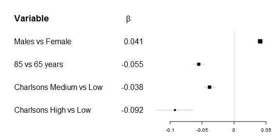
As many of you know it is impossible to combine different types in one matrix/vector and you therefore need to supple the function a list. The number of elements in the list have to be m x n as in any matrix, below is the example plot that I was originally aiming for:
# Generate a labellist
lab_list <- list(rownames(Sweden_w_header),
                 append(list(expression(beta)),
                        round(Sweden_w_header[,"coef"],3)[2:5]))

# Do the actual plot
forestplot2(mean=Sweden_w_header[,"coef"],
            lower=Sweden_w_header[,"lower"],
            upper=Sweden_w_header[,"upper"],
            labeltext=lab_list,
            is.summary=c(TRUE, rep(FALSE, times=nrow(Sweden_w_header)-1)),
            xticks=c(-.1, -.05, 0, .05),
            new_page=TRUE)
Ironically after figuring this out my main supervisor correctly pointed out, while the β is correct - it doesn't really add that much while there is a risk of alienating less statistically oriented readers...
Multi-line forestplots
After this set-back I was at least familiar with the forestplot function allowing further tweaking. Early on I realized that it can be convenient to display the same risk factors multiple times. The idea was that in situations where there are different outcomes, for instance hip replacement re-operation due to infection, dislocation or fracture it can be useful to see the estimates adjacent to each-other. I also used it for comparing Cox proportional hazards models with competing risk regressions and Poisson regression. It turned out to be rather useful.
In the Sweden/Denmark paper the comparison is simply between countries. The code is fairly straight forward, you now need to have to provide the function with a m x n matrix for the mean, lower and upper parameters. The n should be the number of comparison groups, in the Sweden vs Denmark paper the groups are two:
forestplot2(mean=cbind(Sweden[,"coef"], Denmark[,"coef"]),
            lower=cbind(Sweden[,"lower"], Denmark[,"lower"]),
            upper=cbind(Sweden[,"upper"], Denmark[,"upper"]),
            labeltext=rownames(Sweden),
            legend=c("Sweden", "Denmark"),
            # Added the clip argument as some of
            # the Danish CI are way out therer
            clip=c(-.15, .1),
            boxsize=0.3,
            col=fpColors(box=c("blue", "darkred")),
            xlab="EQ-5D index",
            new_page=TRUE)
Originally I was using the legend() function but it turned out to be rather complicated. You can now achieve the same things with the legend parameters, here's an example with a rounded box at the top left corner:
forestplot2(mean=cbind(Sweden[,"coef"], Denmark[,"coef"]),
            lower=cbind(Sweden[,"lower"], Denmark[,"lower"]),
            upper=cbind(Sweden[,"upper"], Denmark[,"upper"]),
            labeltext=rownames(Sweden),
            legend=c("Sweden", "Denmark"),
            legend.pos=list("topleft"),
            legend.r=unit(.2, "npc"),
            legend.gp=gpar(col="grey", fill="#FAFAFF"),
            # Added the clip argument as some of
            # the Danish CI are way out therer
            clip=c(-.15, .1),
            boxsize=0.3,
            col=fpColors(box=c("blue", "darkred")),
            xlab="EQ-5D index",
            new_page=TRUE)
I hope you'll find the forestplot function as useful as I have.

Very nice. I would make sure that the legend is in the same order as the graphic content as in the second plot but not in the first plot. Also since the content is arranged vertically it would be easier to read if the legend were also arranged vertically as in the first few plots but not in the first plot in the Multi-Line Forestplots section.
Thanks, excellent suggestion. I’ll make sure to include the enhancement in the next version.
Beautiful idea, Max. Thanks so much for the effort and the code. I will try to use it in my next paper.
Is there a way to produce a forest plot with something other than the BOX as the marker ? I know it’s a common way to show the mean value, but it’s a bit imprecise. It would be nice to use a diamond, for instance.
Also — is it possible to increase the size of the X axis tick mark labels? It seems to ignore cex.
Thanks.
Hi Rick,
I’ve added the option of customizing the drawing of the confidence interval. You can now use diamonds, circles and points. Download the latest github-version, please try the different options and please report any bugs. Any clarifications to the manual are greatly appreciated. In the update you can also choose different drawing functions for each confidence band.
I’ve also added the cex.axis option that addresses the axis size issue.
/Max
Dear Max Gordon,
The forestplot you have made is extremely useful. I am trying to plot similiar kind for X and Y.
But X and Y are two groups in my plot and does not contain equal coef, lower and upper limit. The X contain 22 values and 2 set with NA (total – 24) and Y containes 24 set with values. When I tried to plot the values the plot for last two values are not displayed and represents a blank space in the picture.
Could you please tell me how to handle the NA values in X and make a picture with both X and Y. I am interested to plot the 24 values in the same picture with only 2 single lines for Y and no value for X.
Best,
Shakthi.
Hi Max,
Thanks for this great code, and the code over on “pimp my forest plot”. I’m trying to replicate what you’re doing, but with a slight modification. I want 3 strata (in comparison to your 4) and within each stratum I want to plot three estimates (a main estimate and then two other secondary estimates for two subgroups).
The problem is: the code works great for 4 strata, but not for three.
I asked a question about this on stack overflow already, but without much help. http://stackoverflow.com/questions/30943990/forest-plot-three-shapes-in-r
Would be great if you could have a look at this please?
Thanks in advance,
Penguin
A square matrix is a little hard to interpret for the software. This is easy to amend, see my answer on Stack Overflow.
Thanks for pointint this out and feel free to suggest any improvements to the documentation (or other functionality).
Is there a way to truncate the axis? I want to display in odds ratios and one of my outcomes has an incredibly large odds ratio.
Hi there Mr Gordon,
Happy Easter! I hope you are well.
Thanks a lot for such a great post about forestplots in R. I know this was written a while ago now, but I was wondering if you knew how to add error bar lines to the plot? I have tried to add them in using ggplot2 codes but they do not appear to be working and I am unsure whether they are compatible or not? I am very much a beginner in R!!
Any help you can give me would be much appreciated!
Kind regards,
Jenny