A blend between a basic scatterplot, lattice scatterplot and a ggplot
In a recent post I compared the Cairo packages with the base package for exporting graphs. Matt Neilson was kind enough to share in a comment that the Cairo library is now by default included in R, although you need to specify the type=”cairo” option to invoke it. In this post I examine how the ggplot and the lattice packages behave when exporting.
Basic plot
The nice thing about the export functions in the R package is that point size scales automatically with the resolution. You don’t need to multiply the “pointsize” parameter any more, you can just go with a higher resolution and everything will look just as nice. This is very convenient as you can adjust both the text and the plotted points by just changing one export parameter. Below is an example of a plot using pointsize 12.
# Create the data
data <- rnorm(100, sd=15)+1:100
# Create a simple scatterplot
# with long labels to enhance
# size comparison
my_sc_plot <- function(data){
  par(cex.lab=1.5, cex.main=2)
  plot(data,
       main="A simple scatterplot",
       xlab="A random variable plotted",
       ylab="Some rnorm value",
       col="steelblue")
  x <- 1:100
  abline(lm(data~x), lwd=2)
}
png(filename="plain_PNG_pt12.png",
    type="cairo",
    units="in",
    width=5,
    height=4,
    pointsize=12,
    res=96)
my_sc_plot(data)
dev.off()
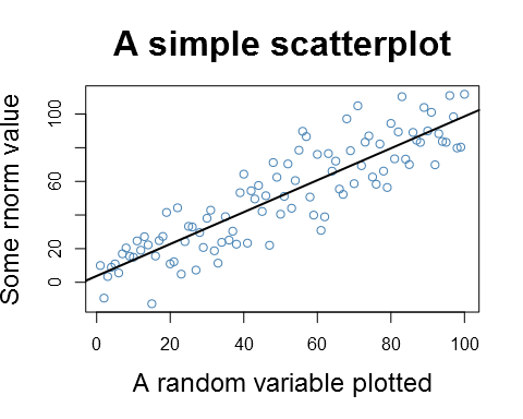
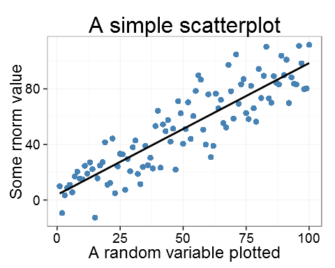
A basic plot with the export point size set to 12
Below is the same with slightly increased point size:
png(filename="plain_PNG_pt14.png",
    type="cairo",
    units="in",
    width=5,
    height=4,
    pointsize=14,
    res=96)
my_sc_plot(data)
dev.off()
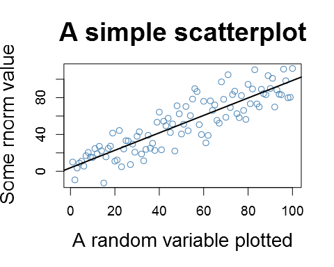
Same image as previous but with the 2 points bigger point size (14pt).
ggplot2
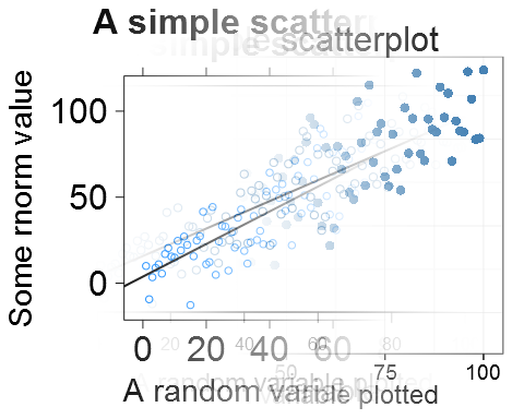
This behavior is different for both the lattice and the ggplot2 packages. In both these packages the text is unchanged by the point size, although it might be good to know that the ggplot's margins change with the point size:
library(ggplot2)
my_gg_plot <- function(data){
  ggplot(data.frame(y=data, x=1:100), aes(y=y, x)) +
    geom_point(aes(x, y), colour="steelblue", size=3) +
    stat_smooth(method="lm", se=FALSE, color="black", lwd=1) +
    ggtitle("A simple scatterplot") + theme_bw() +
    theme(title = element_text(size=20),
          axis.title.x = element_text(size=18),
          axis.title.y = element_text(size=18),
          axis.text.x  = element_text(size=14),
          axis.text.y  = element_text(size=14))+
    xlab("A random variable plotted") +
    ylab("Some rnorm value")
}

png(filename="GGplot_PNG_pt12.png",
    type="cairo",
    units="in",
    width=5,
    height=4,
    pointsize=12,
    res=96)
my_gg_plot(data)
dev.off()
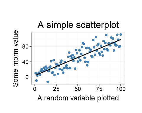
A ggplot with the point size set to 12
Now notice the marigns if we compare with a plot with a the point size x 3:
png(filename="GGplot_PNG_pt36.png",
    type="cairo",
    units="in",
    width=5,
    height=4,
    pointsize=12*3,
    res=96)
my_gg_plot(data)
dev.off()
A ggplot with the point sizQe set to 36
My conclusion is that there seems to be an impact on the margins but not on the text.
Lattice
The lattice package in turn seems to be unaffected by any change to the point size:
library(lattice)
my_lt_plot <- function(data){
  xyplot(y~x, cex=1,
         panel = function(x, y) {
           panel.xyplot(x, y)
           panel.abline(lm(y ~ x), lwd=2)
         },
         lwd=2,
         data=data.frame(y=data, x=1:100),
         main=list(label="A simple scatterplot", cex=2),
         xlab=list(label="A random variable plotted", cex=1.8),
         ylab=list(label="Some rnorm value", cex=1.8),
         scales=list(cex=2))
}

png(filename="Lattice_PNG_pt12.png",
    type="cairo",
    units="in",
    width=5,
    height=4,
    pointsize=12,
    res=96)
my_lt_plot(data)
dev.off()

A lattice plot with the point size set to 12
And to compare with 3 times the point size:
png(filename="Lattice_PNG_pt36.png",
    type="cairo",
    units="in",
    width=5,
    height=4,
    pointsize=12*3,
    res=96)
my_lt_plot(data)
dev.off()
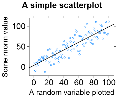
A lattice plot with the point size set to 36
There seems to be no real difference.
Panels
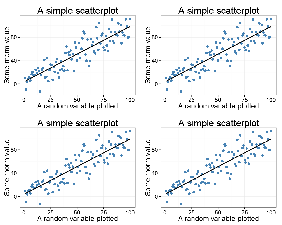
As a last exercise I checked what happens to the plots when using panels/side by side plots (hoping that I now covered the topic). Let's start with the basic plot:
png(filename="Plain_PNG_2x2.png",
    type="cairo",
    units="in",
    width=5*2,
    height=4*2,
    pointsize=12,
    res=96)
par(mfrow=c(2,2))
my_sc_plot(data)
my_sc_plot(data)
my_sc_plot(data)
my_sc_plot(data)
dev.off()
Plain plot, there is a minor difference and the text seems a little smaller in the 2x2 plot
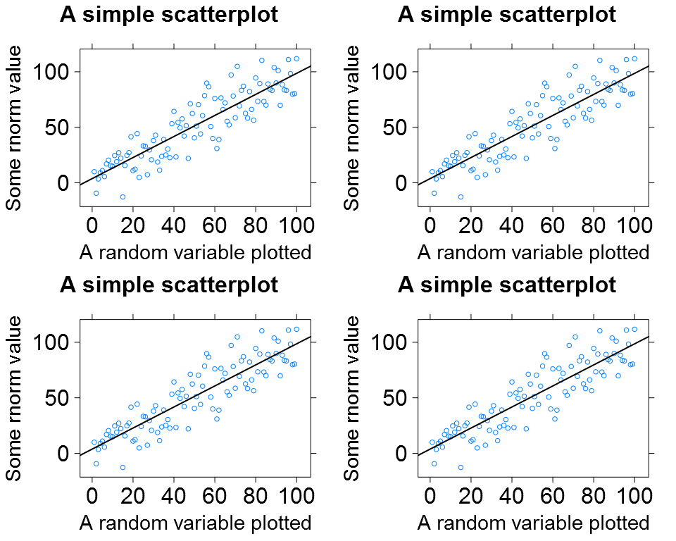
Both the ggplot and the lattice performed better:
png(filename="GGplot_PNG_2x2.png",
    type="cairo",
    units="in",
    width=5*2,
    height=4*2,
    pointsize=12,
    res=96)
p1 <- my_gg_plot(data)
pushViewport(viewport(layout = grid.layout(2, 2)))
print(p1, vp = viewport(layout.pos.row = 1, layout.pos.col = 1))
print(p1, vp = viewport(layout.pos.row = 1, layout.pos.col = 2))
print(p1, vp = viewport(layout.pos.row = 2, layout.pos.col = 1))
print(p1, vp = viewport(layout.pos.row = 2, layout.pos.col = 2))
dev.off()
The ggplot as a 2x2 plot
png(filename="Lattice_PNG_2x2.png",
    type="cairo",
    units="in",
    width=5*2,
    height=4*2,
    pointsize=12,
    res=96)
p1 <- my_lt_plot(data)
print(p1, position=c(0, .5, .5, 1), more=TRUE)
print(p1, position=c(.5, .5, 1, 1), more=TRUE)
print(p1, position=c(0, 0, .5, .5), more=TRUE)
print(p1, position=c(.5, 0, 1, .5))
dev.off()
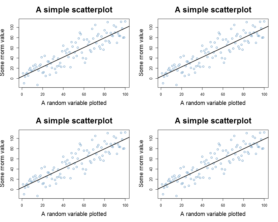
The lattice plot as a 2x2 plot
Summary
In summary both ggplot and lattice seem to ignore the pointsize argument although the ggplot's margins are affected. The panel plots work as expected, although regular plots may need a little tweaking.
Hi,
I tried your scrip because I am having problem with the export of graphs, I am using a Mac, and I am only able to export the graph in jpeg, what is not very efficient. When I ru your first scrip I got the following message:
Error in plot.new() : figure margins too large
libpng warning: Application built with libpng-1.2.26 but running with 1.5.8
and the file that is created is empty.
What should I do?
Thansk for your help.
H
Hi,
is me again. Now every time that I try to have a plot I get the same message as above 🙁
Thanks for your help.
Hi Helena,
the “figure margins too large” is usually caused by the margins being too large for the plot. This means that the margins take all the space and there is nothing left for the plot. My solution is always to just enlarge the image, make your image 10 times larger and see if you still get the error. Also make sure that you width & height are not in pixels (units=”px”) if you intend cm/inches. I always prefer using cm/inches combined with the resolution parameter as this allows me to focus on the task instead of thinking pixels all the time.
Good luck!
Max
Hi Max,
In fact I think that is something else, because all plot that I try to draw now I get the same message.
Error in plot.new() : figure margins too large
libpng warning: Application built with libpng-1.2.26 but running with 1.5.8
So it must have been domething that happen when I tried to run your first script. I have already changed all parameters that I could find in your script and I got te same result.
The only thing that I did not do use to change px to cm, but when I included units=”in” the message for the margins disapperaed, but the file is still empty.
Thanks for your help, I just need to be able to draw plot again 🙁
Helena
Note that a fix has just been committed to Lattice so that it adapts to pointsize. See https://stat.ethz.ch/pipermail/r-help/2013-June/354717.html
ggplot2 might eventually do the same.