

Sitting with a data set with too many variables? The SVD can be a valuable tool when you’re trying to sift through a large group of continuos variables. The image is CC by Jonas in China.
It can feel like a daunting task when you have a > 20 variables to find the few variables that you actually “need”. In this article I describe how the singular value decomposition (SVD) can be applied to this problem. While the traditional approach to using SVD:s isn’t that applicable in my research, I recently attended Jeff Leek’s Coursera class on Data analysis that introduced me to a new way of using the SVD. In this post I expand somewhat on his ideas, provide a simulation, and hopefully I’ll provide you a new additional tool for exploring data.
The SVD is a mathematical decomposition of a matrix that splits the original matrix into three new matrices (A = U*D*V). The new decomposed matrices give us insight into how much variance there is in the original matrix, and how the patterns are distributed. We can use this knowledge to select the components that have the most variance and hence have the most impact on our data. When applied to our covariance matrix the SVD is referred to as principal component analysis (PCA). The major downside to the PCA is that you’re new calculated components are a blend of your original variables, i.e. you don’t get an estimate of blood pressure as the closest corresponding component can for instance be a blend of blood pressure, weight & height in different proportions.
Prof. Leek introduced the idea that we can explore the V-matrix. By looking at the maximum row-value from the corresponding column in the V matrix we can see which row has the largest impact on the resulting component. If you find a few variables that seem to be dominating for a certain component then you can focus your attention on these. Hopefully these variables also make sense in the context of your research. To make this process smoother I’ve created a function that should help you with getting the variables, getSvdMostInfluential() that’s in my Gmisc package.
A simulation for demonstration
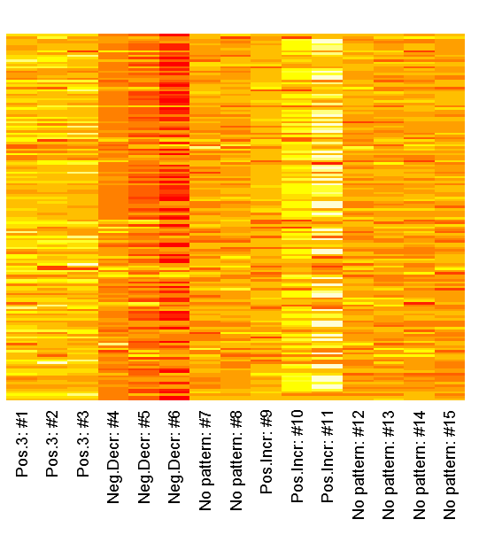
Let’s start with simulating a dataset with three patterns:
set.seed(12345);

# Simulate data with a pattern
dataMatrix <- matrix(rnorm(15*160),ncol=15)
colnames(dataMatrix) <-
  c(paste("Pos.3:", 1:3, sep=" #"),
    paste("Neg.Decr:", 4:6, sep=" #"),
    paste("No pattern:", 7:8, sep=" #"),
    paste("Pos.Incr:", 9:11, sep=" #"),
    paste("No pattern:", 12:15, sep=" #"))
for(i in 1:nrow(dataMatrix)){
  # flip a coin
  coinFlip1 <- rbinom(1,size=1,prob=0.5)
  coinFlip2 <- rbinom(1,size=1,prob=0.5)
  coinFlip3 <- rbinom(1,size=1,prob=0.5)

  # if coin is heads add a common pattern to that row
  if(coinFlip1){
    cols <- grep("Pos.3", colnames(dataMatrix))
    dataMatrix[i, cols] <- dataMatrix[i, cols] + 3
  }

  if(coinFlip2){
    cols <- grep("Neg.Decr", colnames(dataMatrix))
    dataMatrix[i, cols] <- dataMatrix[i, cols] - seq(from=5, to=15, length.out=length(cols))
  }

  if(coinFlip3){
    cols <- grep("Pos.Incr", colnames(dataMatrix))
    dataMatrix[i,cols] <- dataMatrix[i,cols] + seq(from=3, to=15, length.out=length(cols))
  }
}
We can inspect the raw patterns in a heatmap:
heatmap(dataMatrix, Colv=NA, Rowv=NA, margins=c(7,2), labRow="")
Now lets hava a look at how the columns look in the V-matrix:
svd_out <- svd(scale(dataMatrix))

library(lattice)
b_clr <- c("steelblue", "darkred")
key <- simpleKey(rectangles = TRUE, space = "top", points=FALSE,
  text=c("Positive", "Negative"))
key$rectangles$col <- b_clr

b1 <- barchart(as.table(svd_out$v[,1]),
  main="First column",
  horizontal=FALSE, col=ifelse(svd_out$v[,1] > 0,
      b_clr[1], b_clr[2]),
  ylab="Impact value",
  scales=list(x=list(rot=55, labels=colnames(dataMatrix), cex=1.1)),
  key = key)

b2 <- barchart(as.table(svd_out$v[,2]),
  main="Second column",
  horizontal=FALSE, col=ifelse(svd_out$v[,2] > 0,
      b_clr[1], b_clr[2]),
  ylab="Impact value",
  scales=list(x=list(rot=55, labels=colnames(dataMatrix), cex=1.1)),
  key = key)

b3 <- barchart(as.table(svd_out$v[,3]),
  main="Third column",
  horizontal=FALSE, col=ifelse(svd_out$v[,3] > 0,
      b_clr[1], b_clr[2]),
  ylab="Impact value",
  scales=list(x=list(rot=55, labels=colnames(dataMatrix), cex=1.1)),
  key = key)

b4 <- barchart(as.table(svd_out$v[,4]),
  main="Fourth column",
  horizontal=FALSE, col=ifelse(svd_out$v[,4] > 0,
      b_clr[1], b_clr[2]),
  ylab="Impact value",
  scales=list(x=list(rot=55, labels=colnames(dataMatrix), cex=1.1)),
  key = key)

# Note that the fourth has the no pattern columns as the
# chosen pattern, probably partly because of the previous
# patterns already had been identified
print(b1, position=c(0,0.5,.5,1), more=TRUE)
print(b2, position=c(0.5,0.5,1,1), more=TRUE)
print(b3, position=c(0,0,.5,.5), more=TRUE)
print(b4, position=c(0.5,0,1,.5))
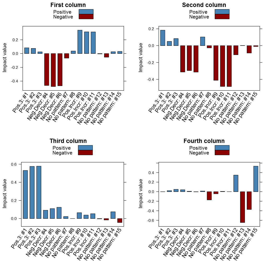
It is clear from above image that the patterns do matter in the different columns. It is interesting is that the close relation between similar patterned variables, it is also clear that the absolute value seems to be the one of interest and not just the maximum value. Another thing that may be of interest to note is that the sign of the vector alternates between patterns in the same column, for instance the first column points to both the negative decreasing pattern and the positive increasing pattern only with different signs. I've created my function getSvdMostInfluential() to find the maximum absolute value and then select values that are within a certain percentage of this maximum value. It could be argued that a different sign than the maximum value should be more noticed by the function than one with a similar sign, but I'm not entirely sure how I to implement this. For instance in the second V-column it is not that obvious that the positive +3 pattern should be selected instead of the negative decreasing pattern. It will anyway appear in the third V-column...
Now to the candy, the getSvdMostInfluential() function, the quantile-option give the percentage of variables that are explained, the similarity_threshold gives if we should select other variables that are close to the maximum variable, the plot_threshold gives the minimum of explanatory value a V-column mus have in order to be plotted (the D-matrix from the SVD):
getSvdMostInfluential(dataMatrix,
                      quantile=.8,
                      similarity_threshold = .9,
                      plot_threshold = .05,
                      plot_selection = TRUE)
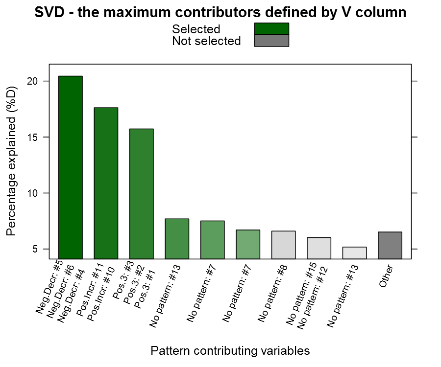
You can see from the plot above that we actually capture our patterned columns, yeah we have our needle 🙂 The function also returns a list with the SVD and the most influential variables in case you want to continue working with them.
A word of caution
Now I tried this approach on a dataset assignment during the Coursera class and there the problem was that the first column had a major influence while the rest were rather unimportant, the function did thus not aid me that much. In that particular case the variables made little sense to me and I should have just stuck with the SVD-transformation without selecting single variables. I think this function may be useful when you have a many variables that your not too familiar with (= a colleague dropped a database in your lap), and you need to do some data exploring.
I also want to add that I'm not a mathematician, and although I understand the basics, the SVD seems like a piece of mathematical magic. I've posted question regarding this interpretation on both the course forum and the CrossValidated forum without any feedback. If you happen to have some input then please don't hesitate to comment on the article, some of my questions:
- Is the absolute maximum value the correct interpretation?
- Should we look for other strong factors with a different sign in the V-column? If so, what is the appropriate proportion?
- Should we avoid using binary variables (dummies from categorical variables) and the SVD? I guess their patterns are limited and may give unexpected results...
The function itself:
#' Gets the maximum contributor variables from svd()
#'
#' This function is inspired by Jeff Leeks Data Analysis course where
#' he suggests that one way to use the \code{\link{svd}} is to look
#' at the most influential rows for first columns in the V matrix.
#'
#' This function expands on that idea and adds the option of choosing
#' more than just the most contributing variable for each row. For instance
#' two variables may have a major impact on a certain component where the second
#' variable has 95% of the maximum variables value, since this variable is probably
#' important in that particular component it makes sense to include it
#' in the selection.
#'
#' It is of course useful when you have many continuous variables and you want
#' to determine a subgroup to look at, i.e. finding the needle in the haystack.
#'
#' @param mtrx A matrix or data frame with the variables. Note: if it contains missing
#'  variables make sure to impute prior to this function as the \code{\link{svd}} can't
#'  handle missing values.
#' @param quantile The SVD D-matrix gives an estimate for the amount that is explained.
#'  This parameter applies is used for selecting the columns that have that quantile
#'  of explanation.
#' @param similarity_threshold A quantile for how close other variables have to be in value to
#'  maximum contributor of that particular column. If you only want the maximum value
#'  then set this value to 1.
#' @param plot_selection As this is all about variable exploring it is often interesting
#'  to see how the variables were distributed among the vectors
#' @param plot_threshold The threshold of the plotted bars, measured as
#'  percent explained by the D-matrix. By default it is set to 0.05.
#' @param varnames A vector with alternative names to the colnames
#' @return Returns a list with vector with the column numbers
#'  that were picked in the "most_influential" variable and the
#'  svd caluclation in the "svd"
#'
#' @example examples/getSvdMostInfluential_example.R
#'
#' @import lattice Hmisc
#' @author max
#' @export
getSvdMostInfluential <- function(mtrx,
                                  quantile,
                                  similarity_threshold,
                                  plot_selection      = TRUE,
                                  plot_threshold      = 0.05,
                                  varnames            = NULL){

  if(any(is.na(mtrx)))
    stop("Missing values are not allowed in this function. Impute prior to calling this function (try with mice or similar package).")

  if (quantile < 0 || quantile > 1)
    stop("The quantile mus be between 0-1")

  if (similarity_threshold < 0 || similarity_threshold > 1)
    stop("The similarity_threshold mus be between 0-1")

  svd_out <- svd(scale(mtrx))
  perc_explained <- svd_out$d^2/sum(svd_out$d^2)
  # Select the columns that we want to look at
  cols_expl <- which(cumsum(perc_explained) <= quantile)

  # Select the variables of interest
  getMostInfluentialVars <- function(){
    vars <- list()
    require("Hmisc")
    for (i in 1:length(perc_explained)){
      v_abs <- abs(svd_out$v[,i])
      maxContributor <- which.max(v_abs)
      similarSizedContributors <- which(v_abs >= v_abs[maxContributor]*similarity_threshold)
      if (any(similarSizedContributors %nin% maxContributor)){
        maxContributor <- similarSizedContributors[order(v_abs[similarSizedContributors], decreasing=TRUE)]
      }
      vars[[length(vars) + 1]] <- maxContributor
    }
    return(vars)
  }
  vars <- getMostInfluentialVars()

  plotSvdSelection <- function(){
    require(lattice)

    if (plot_threshold < 0 || plot_threshold > 1)
      stop("The plot_threshold mus be between 0-1")

    if (plot_threshold > similarity_threshold)
      stop(paste0("You can't plot less that you've chosen - it makes no sense",
              " - the plot (", plot_threshold, ")",
              " >",
              " similarity (", similarity_threshold, ")"))

    # Show all the bars that are at least at the threshold
    # level and group the rest into a "other category"
    bar_count <- length(perc_explained[perc_explained >= plot_threshold])+1
    if (bar_count > length(perc_explained)){
      bar_count <- length(perc_explained)
      plot_percent <- perc_explained
    }else{
      plot_percent <- rep(NA, times=bar_count)
      plot_percent <- perc_explained[perc_explained >= plot_threshold]
      plot_percent[bar_count] <- sum(perc_explained[perc_explained < plot_threshold])
    }

    # Create transition colors
    selected_colors <- colorRampPalette(c("darkgreen", "#FFFFFF"))(bar_count+2)[cols_expl]
    nonselected_colors <- colorRampPalette(c("darkgrey", "#FFFFFF"))(bar_count+2)[(max(cols_expl)+1):bar_count]

    max_no_print <- 4
    names <- unlist(lapply(vars[1:bar_count], FUN=function(x){
              if (is.null(varnames)){
                varnames <- colnames(mtrx)
              }
              if (length(x) > max_no_print)
                ret <- paste(c(varnames[1:(max_no_print-1)],
                        sprintf("+ %d other", length(x) + 1 - max_no_print)), collapse="\n")
              else
                ret <- paste(varnames[x], collapse="\n")

              return(ret)
            }))
    rotation <- 45 + (max(unlist(lapply(vars[1:bar_count],
                      function(x) {
                        min(length(x), max_no_print)
                      })))-1)*(45/max_no_print)

    if (bar_count < length(perc_explained)){
      names[bar_count] <- "Other"
      nonselected_colors[length(nonselected_colors)] <- grey(.5)
    }

    las <- 2
    m <- par(mar=c(8.1, 4.1, 4.1, 2.1))
    on.exit(par(mar=m))

    p1 <- barchart(plot_percent * 100 ~ 1:bar_count,
        horiz=FALSE,
        ylab="Percentage explained (%D)",
        main="SVD - the maximum contributors defined by V column",
        xlab="Pattern contributing variables",
        col=c(selected_colors, nonselected_colors),
        key=list(text=list(c("Selected", "Not selected")),
            rectangles=list(col=c("darkgreen", "#777777"))),
        scales=list(x=list(rot=rotation, labels=names)))
    print(p1)
  }

  if (plot_selection)
    plotSvdSelection()

  ret <- list(most_influential = unique(unlist(vars[cols_expl])),
      svd = svd_out)
  return(ret)
}
Nice Writeup. I also followed the class of Jeff Leek and the SVD was one of the highlights for me personally.
Would you mind showing the getSvdMostInfluential() function for learning purposes? 🙂
Best,
Michael
Ok, added it. You’re aware though that all you need to do is just write the function name without () to get the code, once you’ve loaded the package?
Hello Max,
Thanks for this post. I took a different Coursera course taught by Andrew Ng and we covered SVDs as well. Funny, I found your post because I was looking for methods to process a dataset with numerous variables, including one categorical variable. I need to go back and review my course notes to see if I can apply this method. I’ll get back to you if I uncover any pertinent answers to the questions you posed on R-blogger.
Regards,
Al D.
Thank you Al. I’ve listened in on some of Nathan Kutz lectures on computational methods for data analysis and he states that the U and V vectors are precise up to a sign. I interpret this as that my intuition is correct, the sign does not really matter.
I am also currently doing Andrew Ng’s Machine Learning class. He hasn’t talked about how to apply and interpret the SVD, but I wouldn’t be surprised if it turns up.
Hi Max,
Nice write up. I have the same grouse against PCA that it does not preserve variables in the original shape. I want to reduce dimensionality but while keeping my column names intact as that helps interpret any model I am working on. SAS Varclus(although it follows the clustering of variables) gives you the power. But I am unable to figure out how to do this with SVD. Can you please tell me what getSvdMostInfluential() does? Your response will be deeply appreciated.
The getSvdMostInfluential() tries select variables that are most influential on each V-column. It is an aid when you have too many variables and you want to get an idea where to start when you don’t want to do the PCA-conversion.
Thanks for the reply Max. Sorry for not being specific earlier. Our influential variables explain only a part of the big vectors. Will I be correct if I select the most important variables in my model on the basis of this function or as you said it “gives an idea where to start” and not the final list of variables? Also has the approach you have suggested here the level of acceptability you were looking for when you posted this in April
Max,
A thought – you have kind of clustered Neg.Decr: #5, Neg.Decr: #6 and Neg.Decr: #4 – they are having highly correlated. Should we not pick one of them only if are doing some modeling?
Thanks,
Ratheen
Yes, I think it is wiser to pick variables that have the opposite sign than perhaps the same. There is no real right or wrong here, just some starting points that may help.
I think you may want to look into bayesian model averaging (check out the BMA package for R) if you’re trying to select a distinct set of variables for your model. I view this function as an aid when you receive a data set that you may not be that experienced with and you need some starting points.
I haven’t gotten any feedback but after writing did parts of Nathan Kutz classes on computational science (didn’t have time to finish the classes) and what he said confirmed my ideas of the sign is unimportant.
This is what the doctor ordered. I am new to R.
I am auditing the Data Analysis course (excellent course)
I would appreciate:
1. A simple explanation of using svd and its respective “V” matrix to identify those variables with the most variance
2. I have 100 features/values and would like your opinion on how best to represent that much information
Great Article and very complementary to the coursera course!
Thank you, not sure I’m the best suited to explain the V-matrix – I suggest you try with Stack Exchange’s math site: http://math.stackexchange.com
I think when you have 100 features then the only reasonable is to start thinking in terms of Manhattan-plots, see http://en.wikipedia.org/wiki/Manhattan_plot
In general when you have that many variables you don’t have any real hypothesis regarding each variable – your more interested in examining their combined relationship with the outcome. Here there are two approaches, try to select those of most importance or use all of them in some kind of smart neural network or similar. The problem is usually overfitting with this many variables so you need to take that into consideration.