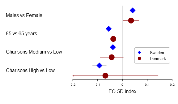

The new rmarkdown revolution has started. The image is CC by Jonathan Cohen.
The new R Markdown (rmarkdown-package) introduced in Rstudio 0.98.978 provides some neat features by combining the awesome knitr-package and the pandoc-system. The system allows for some neat simplifications of the fast-track-publishing (ftp) idea using so called formats. I’ve created a new package, the Grmd-package, with an extension to the html_document format, called the docx_document. The formatter allows an almost pain-free preparing of MS Word compatible web-pages.
In this post I’ll (1) give a tutorial on how to use the docx_document, (2) go behind the scenes of the new rmarkdown-package and RStudio ≥ 0.98.978, (3) show what problems currently exists when skipping some of the steps outlined in the tutorial. Continue reading